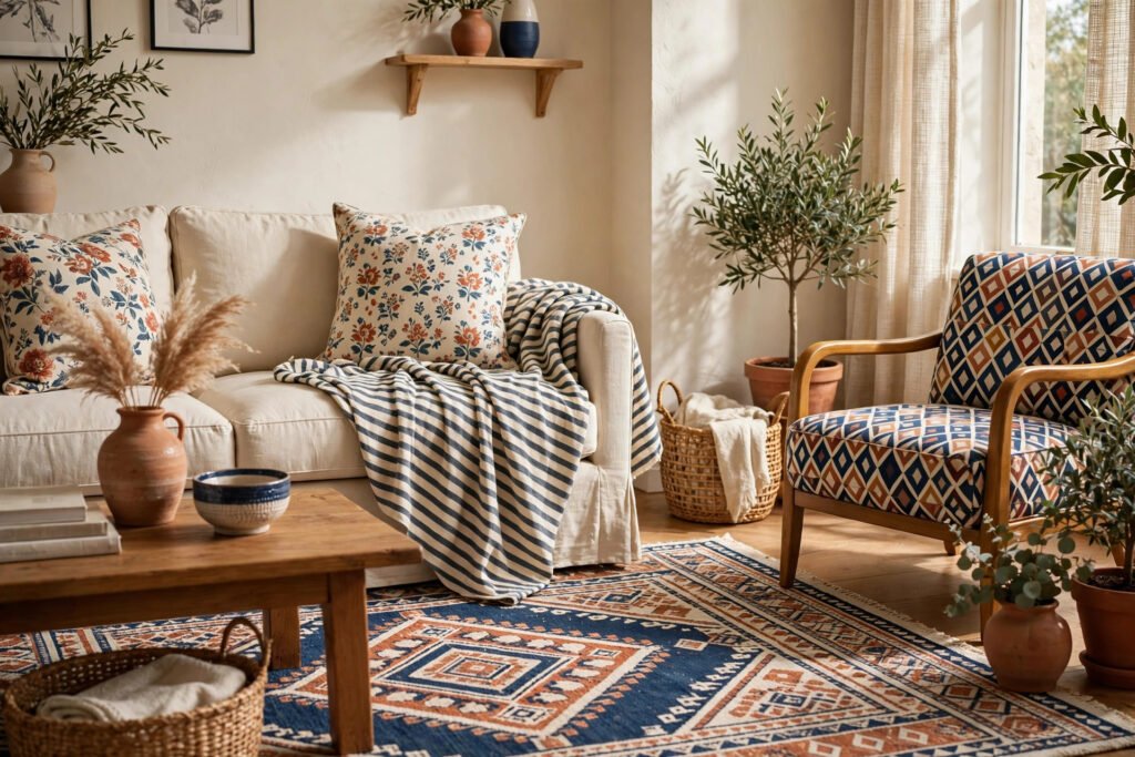

How to Mix Patterns in Home Decor Without Clashing
A room full of pattern can feel like a boutique hotel — or like a jumble sale. The difference is rarely money; it is method. Learning how to mix patterns home decor is one of those skills that looks like natural talent but is actually a handful of simple rules, repeated until they become instinct. Once you know them, you can pair stripes with florals, checks with geometrics, and bold prints with quiet ones, without the room ever feeling chaotic.
The good news is that you do not need a designer’s budget to get this right. Most pattern mixing happens in the cheapest parts of a room: cushions, throws, curtains, rugs and bedding. Get those right and the whole space falls into place.
1. Start With the 60-30-10 Rule
Every good pattern mix starts with a plan for how much of each thing the eye will see. The classic 60-30-10 rule is the simplest version: about 60% of the room is your dominant, quiet base — usually solid walls, a plain sofa or a neutral rug. About 30% is your secondary pattern or colour, often curtains or bedding. The final 10% is the accent: the bold cushions, the patterned throw, the statement lampshade.
When the room feels chaotic, it is almost always because the 10% has crept up to 40%. One loud pattern should be the star; the others support it. If you have a bold floral sofa, your curtains and cushions should be calmer. If the sofa is plain, the cushions and rug can carry the pattern.
2. Vary the Scale — Big, Medium, Small
The single most useful rule in pattern mixing is scale. Patterns that are all the same size fight each other; patterns in different sizes get along. Aim for three scales: one large pattern, one medium pattern and one small pattern.
A large-scale floral on curtains or a duvet cover, a medium-scale stripe on cushions, and a small-scale geometric on a throw or a lampshade is a combination that almost always works. The eye reads them as separate layers instead of one noisy surface. If two patterns look like they are arguing, check their scale first — the fix is usually to swap one of them for a bigger or smaller version of the same idea.
3. Stick to a Shared Colour Palette
Patterns mix happily when they share at least one colour. A navy-and-white stripe sits comfortably next to a floral that contains navy, even if the floral also has pink and green. The shared colour is the thread that ties them together.
Pick two or three colours for the room and let every pattern contain at least one of them. A warm palette — terracotta, cream and sage, for example — will hold together across stripes, checks and botanical prints. A cool palette — navy, grey and white — does the same. If a pattern has a colour that appears nowhere else in the room, it will look like a stranger. Either repeat that colour somewhere small, like a cushion or a vase, or choose a different pattern.
4. Mix Pattern Families, Not Twins
Stripes, florals, geometrics, checks, animal prints and abstract designs are different pattern families, and the easiest mixes combine two or three different families. A floral with another floral is much harder to get right than a floral with a stripe, because the eye compares them directly and notices every clash.
A reliable formula for beginners is one organic pattern (floral, botanical or abstract) plus one geometric pattern (stripe, check or chevron) plus one solid. The organic pattern brings softness, the geometric brings structure, and the solid gives the eye somewhere to rest.
5. Use Solids as Breathing Room
Pattern needs empty space to be appreciated. A room with pattern on the curtains, the sofa, the cushions, the rug and the walls has no quiet surface left, and the eye has nowhere to rest. Solids are not boring — they are what make the patterns look intentional.
Keep at least one large surface plain: the sofa, the bedspread, the rug or the wall. Then let the pattern live on the smaller pieces around it. A plain sofa with patterned cushions and a patterned throw looks designed; a patterned sofa with patterned cushions and a patterned rug looks accidental.
6. Anchor the Room With One Hero Pattern
Every well-mixed room has one pattern that leads. It is usually the biggest and boldest one — the curtains, the rug or the wallpaper on one wall — and everything else is chosen to support it. Decide which pattern is the hero before you buy anything else, and let it set the colours and the mood.
7. Test Patterns Together Before You Commit
Never judge a pattern on its own. Two fabrics that look perfect separately can clash badly side by side, and two that look odd alone can work beautifully together. Before buying, gather the fabrics, cushions or samples in one place and look at them together in the room’s actual light.
Patterns Room by Room
- Living room: Start with the rug or curtains as the hero, add two cushion patterns in different scales, and keep the sofa solid. A patterned throw over one arm adds a third layer without taking over. See our roundup of the best throw blankets for a cosy living room (https://somedecor.com/best-throw-blankets-living-room/) for ideas that pair well with patterned cushions.
- Bedroom: Bedding is the hero here. A patterned duvet with solid sheets and one patterned cushion, or a solid duvet with two patterned pillowcases, both work. Keep the curtains simpler than the bedding so the two do not compete.
- Small rooms: Use fewer patterns and smaller scales. Two patterns plus solids is plenty in a small bedroom or a rented flat, and a large mirror (https://somedecor.com/best-budget-mirrors/) will bounce light around and keep the patterns from feeling heavy. Our guide on how to decorate a rental without losing your deposit (https://somedecor.com/how-to-decorate-a-rental/) has more small-space ideas.
Mistakes to Avoid
- Matching everything exactly. A room where the curtains, cushions and rug all carry the same print looks like a matching set from a catalogue, not a home. Let patterns be cousins, not twins.
- Ignoring the undertones. A warm cream and a cool white look similar on a screen but clash in real life. Check undertones — warm or cool — before mixing neutrals.
- Too many bold patterns. One bold pattern is a statement; three is a shouting match. If you love bold prints, use one and support it with quieter ones.
- Forgetting texture. Pattern is not only print. A woven basket, a knitted throw, a velvet cushion and a linen curtain add visual variety that counts as pattern without adding print. Texture is the easiest way to make a mix feel rich rather than busy.
- Buying the whole set at once. Pattern mixing works best when it grows slowly. Buy the hero first, live with it for a week, then add the next layer. Impulse sets are how rooms end up with five competing prints.
FAQs
How many patterns can I mix in one room?
Three is the sweet spot for most rooms when you are learning how to mix patterns home decor: one large, one medium and one small, in different families and sharing at least one colour. Experienced decorators can push to four or five, but for a first attempt, three patterns plus solids is the safest route to a room that looks designed rather than busy.
Can I mix stripes and florals?
Yes — it is one of the most reliable combinations in home decor. Stripes are structured and geometric, florals are soft and organic, so they balance each other. The trick is to vary the scale and share a colour: a large floral with a fine stripe, or a bold stripe with a small-scale floral, both work well.
What is the 60-30-10 rule in pattern mixing?
It is a guide to proportion: roughly 60% of the room is a calm, solid base (walls, sofa, rug), 30% is a secondary pattern or colour (curtains or bedding), and 10% is the bold accent pattern (cushions, throws, lampshades). It stops any one pattern from taking over the room.
How do I mix patterns in a small room?
Use fewer patterns — two is enough — and keep them small in scale, with plenty of solid surfaces in between. Light colours and a large mirror help the room feel open, and one hero pattern on the bedding or curtains is better than pattern on every surface.
Should patterns match the furniture colour?
They should share at least one colour with the room, and that colour often comes from the largest piece of furniture — the sofa, the bed or the rug. You do not need an exact match; a shared colour family is enough. If a pattern contains a colour that appears nowhere else in the room, repeat that colour in a small accessory so it feels deliberate.
Related reading: How to Choose the Right Paint Color for a Small Room (https://somedecor.com/paint-color-small-room/) · How to Hang Curtains the Right Way (https://somedecor.com/how-to-hang-curtains/) · Best Affordable Area Rugs Under $100 (https://somedecor.com/affordable-area-rugs-under-100/) · Best Throw Blankets for a Cozy Living Room (https://somedecor.com/best-throw-blankets-living-room/) · How to Decorate a Rental Without Losing Your Deposit (https://somedecor.com/how-to-decorate-a-rental/)


Pingback: DIY Wall Decor Ideas: 10 Budget Projects That Look Great
Pingback: Affordable Dining Room Decor: 15 Ideas on a Budget
Pingback: Bedding That Looks Expensive: 8 Budget Tips